In this evaluation, I will be writing about the
overall feedback taken from my video pitch of Kid's street wear. I will also
analyse what could be improved to make my photos better so it easy to establish
what my photos convey through composition following my magazine idea. For this
task we were asked to pitch our ideas for a photo feature in a magazine of your
choice we were asked to produce a series of pictures that keeping with the
magazines style and are appropriate for the target audience.
For my idea, I have chosen to use a fashion
magazine to feature my photos in. This will follow a similar style to a youth
and pop cultured magazine such as Highsnobiety and Dazed. I chose to use
toddler as my models for this photo feature that will be shot similar
to retailers’ magazines like Gap kids. I wanted to combine both
children and street wear together in one photo for the magazine feature. This
idea was inspired from Seoul Fashion week as the children attended the event
wearing street inspired looks. After seeing these photos, I wanted to follow
the same style and content for the magazine from the picture I saw online. The
way I wanted to approach this was to follow the first mood board I made editing
the lights onto the pictures to promote pop and youth culture with the photos.
For my final images, I have these series of photos
at different locations one at a party and the other at a children’s clothes
shop. For this project, I wanted to use different composition in which
demonstrates child wear, but editing the picture further. I wanted to promote
streetwear within the pictures and add seriousness by editing the photo’s
contrast. From the feedback given on the series of photos I think I could've
spent more time editing further to fit the chosen theme. E.g. using colour in
photo in which highlights street wear fashion similar to what I have prepared
in the video pitch. As the children at the Seoul Fashion week pictures convey
high street fashion for kids from the vibrant of their clothing allowing their
clothes to speak for children's streetwear instead of using the background
being the subject focus than to the actual model. Using this type of approach
or using a different style would’ve have targeted better to parents. The sepia
look takes away the purpose of the picture if there isn’t any colour to suggest
that its streetwear you’re trying to convey. The photos would have been able to
follow the theme better and the pictures could have been shot simpler as in the
mood board portrays using shallow depth of field to show what it is in the
picture, so that an audience can focus the main points of the photos. As for
the target audience, I think it will appeal to both young parents as they can
adapt to the latest fashion trends coming from Fashion week or high street
brand inspired looks. The type of audience that this magazine was to be aimed
at both readers of Dazed and Gap kids which is similar to the type of clothing
Zara sells for children which are inspired by street wear.
I think from a picture editors’ points of view the
picture or pictures may be altered to fit the subject/ theme of the magazine
better the editing seems to be lacking. Compare to a professional photographer
work setting the aperture to create a blurry background could've been ideal to
make the pictures even better.
Overall, If I was given a chance to redo this
project I would've thought thoroughly through the types of compositions that
best portrays the theme to approach the targeting audience and what shots make
fill the image on a professional level of photography. For example, using
painting with lights would've given a whole new look to streetwear as the
pictures usually are taken in urban areas like streets and alley ways. The locations
of where the photos were shot do follow the child theme, but thinking of a more
creative location to help portray streetwear. Using a range of locations and
different models would have showed variety and ranges in which says that
streetwear can be worn for every one of all ages and genders.


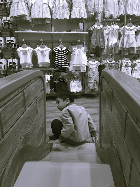 These are my three chosen pictures for my magazine to promote children streetwear. Each shot a different locations and wearing different outfits that enhances the culture of youth and streetwear. To further improve the compositions of my three final pictures further editing on photoshop will demonstrate the type of pictures I'd want to feature for the magazine. That best targets the type of audience the magazines wants to promote younger generations clothing of streetwear.


